Have you ever found yourself struggling to read something, not due to content, but due to its inability to be visually appealing? I guess you could say it's just not your type *bah dum tss*. In all seriousness, though, it's not your type or really anyone's. Luckily, there are typographers who work to ensure the reader's viewing pleasure is always kept in mind.
Typography is collectively defined as the art of arranging type into a readable and beautiful piece of work. Those who study the topic delve into subtopics such as color, legibility, and readability which can be further broken down into positive and negative images, contrast, and italic vs upright type. The point is, typography is a vital element in providing us with books not only our minds, but also our eyes can enjoy.
Typography is collectively defined as the art of arranging type into a readable and beautiful piece of work. Those who study the topic delve into subtopics such as color, legibility, and readability which can be further broken down into positive and negative images, contrast, and italic vs upright type. The point is, typography is a vital element in providing us with books not only our minds, but also our eyes can enjoy.
Recreating the Original
The first editions of Fitzgerald's Great Gatsby are known primarily by the colorful dust jacket, illustrated by Francis Cugat. Today, the dust jacket alone can mark the price up $100k easily. The illustrations, however, work with the font in harmony to give us one of the most memorable book covers to ever exist. With this particular type face being so widely-recognized, an artist set out to recreate the iconic letter styling. Railey Collins of Anderson, South Carolina came up with a rendition remarkably similar to that found on the covers of those oh-so-sought-after Cugat first editions. Below are images of her work. As you can see, she applied the same font to both old and new images depicting characters from the book.
2013 Movie
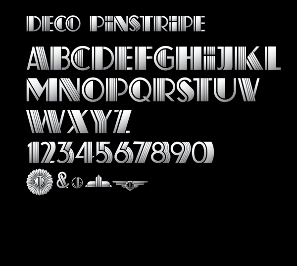

When The Great Gatsby movie came out in 2013, chances are, the font used in the advertisements and displays caught your attention, and this was no accident. Whether you knew what the 1920's was really about or not, it was easy to tell that the typography of this new movie and version of the book were special. Baz Luhrmann paired with Like Minded Studios to develop this iconic typeface which is based on the alphabet designs of K.H. Schaefer entitled Deco Pinstripe. By combining solid and pinstripe characters and accompanying them with a 3-D feature, Luhrmann's vision of creating a logo that enveloped the Jazz Age culture was brought to life.
Music for the Eyes
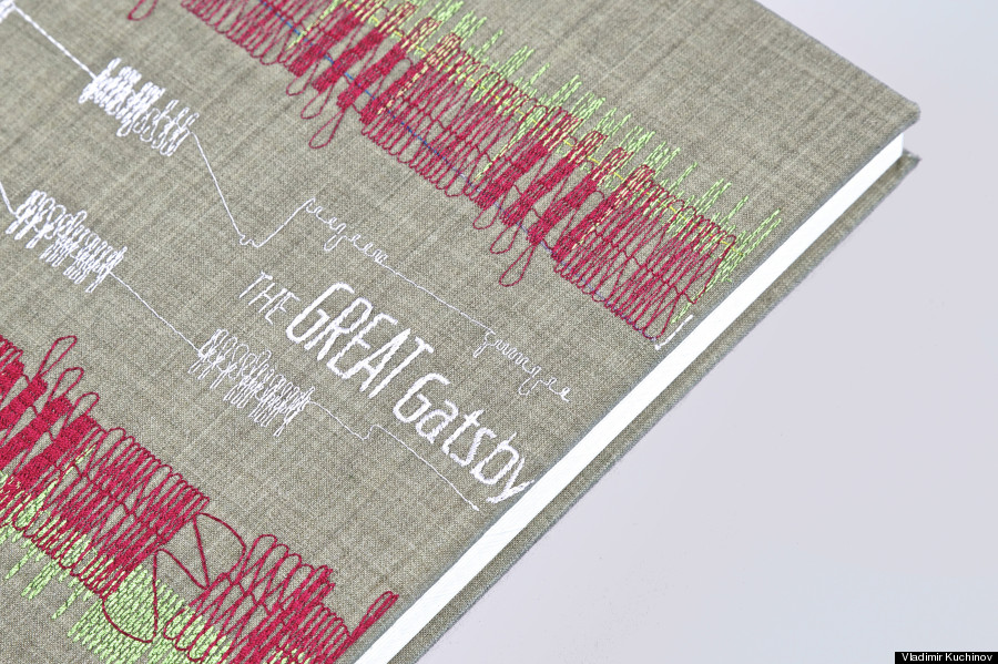
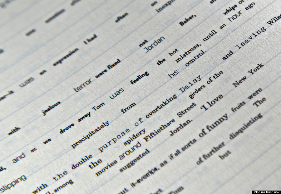
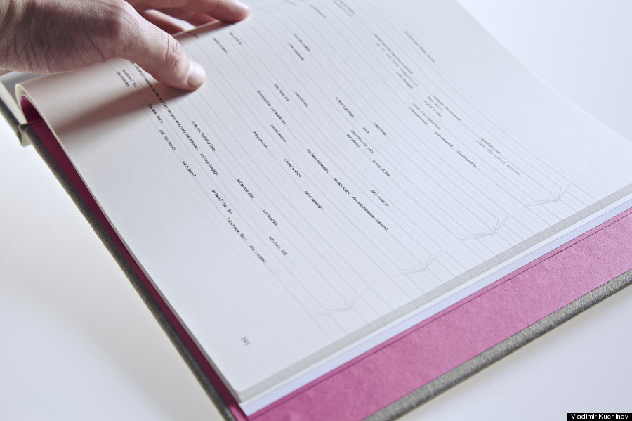
While the original and the newer renditions of the iconic Gatsby typeface are both equally stunning and beautiful, one artist decided that there was no better way to incorporate the new and the old like marrying technology, Gatsby, and Jazz Age music. A Russian designer named Vladimir Kuchinov dreamed up the idea to turn Fitzgerald's best work into something altogether different by using a method known as 'generative typography.' He calls it Generative Gatsby.
An interview was conducted with Kuchinov, and he was asked to explain what exactly generative typography is. His response was, "The definition of "generative typography" is quite complex. Basically, it is any text interpreted by a code-driven algorithm, which was designed by you as an author. In a classical sense, you are usually typesetting everything with your hands. In a generative method, you are creating a system, a script, which is doing everything by itself. And by controlling its structure and parameters you can have different generated variations."
To explain what Mr. Kuchinov did, however, may be the more tricky part. According to him, he used MIDI files (electronic musical instruments and accompanying software) to associate each of the nine chapters he chose with a jazz-style music selection. From there, he assigned each instrument no less than six typefaces, according to their popularity in jazz bands. By doing this, he was able to produce a version of Gatsby where each word was interpreted in relation to the song and instrument of choice. The way the words appear on the pages is similar to that of sheet music, but rather than notes, you have letters.

While Kuchinov seems extremely proud of his art, as he should be, he cautions that the work should be interpreted as just that: art.
In response to the question,
"In the foreseeable future, how do you see generative typography affecting a reader's experience? Do you see generative typography having practical implications in a world of tablets and digital reading?", he says, "I did my degree dissertation on prospects of generative typography in creative industry, so I am quite confident about this issue. By now, it is far away from practical implication, especially in terms of legibility. It is a brand new area and there are not so many projects being done now. The most famous one is the "Frankenfont" by Ben Fry, the creator of Processing language. For now, generative typography is good for posters and display types and is still in an experimental state for practical usage in books and publishing industry. However, I strongly believe, that as long as it gathers its "critical mass" of successful projects everything could change."
 RSS Feed